Motorola logo gets a makeover -- and a 'Google company' tagline
In with the new ...
Google has made a lot of changes at Motorola since it acquired the company a year ago.
The Web giant, which bought Motorola in May 2012 for $12.5 billion, sold the Motorola Home set-top business for $2.35 billion, settled a massive lawsuit with TiVo, and laid off thousands of employees in a reorganization that called for the closure of a third of the company's 94 offices.
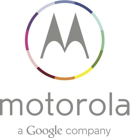
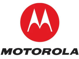
Perhaps in an effort to highlight the company's new character, Motorola has dumped the decades-old red button "M" logo for something more colorfully in line with its new owners' tastes. The new logo, which was first spotted by The Verge earlier Wednesday, sports a rainbow of colors encircling the familiar "M."
... and out with the old.
The new logo also ditches the bold italic, capped "Motorola" for a lowercase company name in a thinner, softer font. And in case you forgot who was in charge, the Web giant also added a tagline that reads "a Google company."
The logo reportedly made its debut on the Web site for Techweek, a tech confab scheduled to begin next week in Chicago.
Source : Cnet.
Login to the community
No account yet? Create an account
Enter your E-mail address. We'll send you an e-mail with instructions to reset your password.


