New Community UX Enhancements

  • 7 November 2017
  • 93 replies
  • 365 views

Userlevel 7
Badge +48
We've been working hard over the last few weeks on trying to enhance the overall design and UX of the homepage on the community. Today, I'm happy to announce that we launched these improvements!  
 
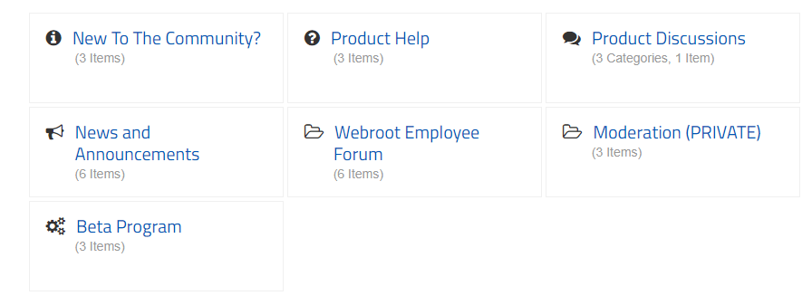
The biggest thing you'll notice is the new tiled nav in the center column. We've made it easier to find what you need at a high level without having to scroll and scroll down to the bottom of the page. We will also be moving some of the components from the side rail into the main nav. 
 
Other improvements include: 
  • Shrinking the size of the header image
  • Replacing default folder icons with cusom icons
  • Header mobile styles updated/fixed issues for mobile icons and overall treatment (both consumer and business)
  • Header link style updated to make link more readable (both consumer and business)
  • Sidebar general style update to the headings/titles
  • Update to tile styling to make cleaner and sharper display overall, and more interactive
 
https://community.webroot.com/t5/image/serverpage/image-id/32088i1111ECE6F997823A/image-size/large?v=1.0&px=999


Let us know what you think in the comments below! 

93 replies

Userlevel 7
Badge +54
I like it but I feel like there is something missing from it. I can understand the tiled approach and the box above containing featured topics but I think it is a bit too minimalist.
Userlevel 5
Badge +1
Here's my feedback. Unless viewing this site on an iPad / Tablet, then the UI is inappropriate for the majority of other users.
 
Three key points, but all related:
- there are acres of empty space, screen real-estate should be optimised not completely wasted
- much more scrolling needed by the user
- scanning through posts to look for a pertinent topic or comment requires MUCH more effort.
 
None of these are improvements for non-tablet users in my opinion, rather they are a detriment to the user experience when using a desktop or laptop with keyboard and mouse.
 
Then it gets even worse...
 
The KB overviews are just a complete shambles, a hodgepodge, a disarray of strewn articles. This layout requires every single tile content to be read, no natural scanning through and speed-reading by the eye-brain is possible. The user completely grinds to a halt. The only way forward is to use the search function.
 
In other words, change needs to be an improvement, not a worsening, and not change for the sake of change, or for the sake of some passing designers' fad. Making an assumption that everyone uses a tablet / pad and if they don't, the rest just have to put up with the new UI design is wholly inappropriate.


Userlevel 7
Badge +62
@ wrote:
Well, that is strange! I just signed out, and signed in, and now I am appearing....No longer one of the "Disappeared". ;)
Yes this happens to me  especially if I refresh FF alot and like Daniel has said this has been going on for years.
 
BTW: I am usually signed in on 3 computers.;)
Userlevel 7
@ wrote:
Hi Drew ,
 
I liked it before the change honestly. But it will take time to get used to again. :D
I am with you on that one, Sherry
 
Was better before. Change for change sake is not necessarily a good thing. There has been so much change recently that I feel we need a pause and therefore some stability for at least a short while.
Userlevel 7
"Was better before:" -   "Amen... Say it again....Amen" ;)
                                     
Userlevel 7
Badge +56
I have to agree with the others the home page doesn't look good as it did.
Userlevel 7
Badge +48
Great feedback from everyone and the team and I appreciate it. Thank you for it. 
 
I understand that this change can be a bit jarring but we are trying to improve the overall experience for everyone based upon the information we're gathering and online community best practices. It's all a part of our commitment to continuously improve the community experience.  
Not trying to be "polemical", as Baldrick puts it, but just wanting to throw some clarity on what I was trying to say.
 
One thing I was getting confused about was that I tend to automatically (and quite mistakenly) think that WSA = WSA for PCs. Kinda shows my IT limitations, dunnit 😠. Sorry for my muddled thinking 😞.
 
So when I was saying that I thought it was superfluous to have different categories for different Product Versions, I was actually referring to the PC Product versions. Sorry for the confusion, guys!
 
May I therefore clarify why I was saying the above?
 
The only time it makes the blindest bit of difference which PC Product Version you are using is when it concerns the extra features, i.e. the bells and whistles, as all the AV stuff is precisely the same for all versions (that is, unless I've got this completely wrong in which case perhaps a Webroot employee such as @ or @ can correct me on this). Which is why it seems to me totally pointless to have different categories for different PC Product Versions.
 
So let me modify what I was saying: I feel that the categories for the PC Product Versions Antivirus, Internet Security Plus and Complete (and arguably AV for PC Gamers) should be merged because from the point of view of the AV stuff there is absolutely no difference between them. However, Android, Mac and Mobile for iOS should continue to have separate categories (though let me say I am speaking from almost total ignorance regarding these products as I do not personally know them). I believe that there should also be separate categories for each bell and whistle, e.g. Backup & Sync, Password Manager, System Optimizer, System Analyzer, Personalized Security Report. Why? Because some of these bells and whistles are not unique to one product version so it can become confusing and difficult to find all the threads on these topics because they are currently scattered around different Categories. And of course it would be even easier if they each had their own category. I further believe (though I may be wrong on this) that it should be feasible, with proper planning and forethought, to set up a procedure for generating a new thread in a way that makes it clear to the poster when their question belongs to one of the "bells and whistles" categories.
 
Well, I'm sure a lot of people may disagree with me on some or all of this, but that's my view.
Userlevel 7
Badge +54
I am invisible now but have been on and off all of the day, but just expect it now as one of the quirks of the Community.
Userlevel 7
Badge +62
Hi Drew ,
 
I liked it before the change honestly. But it will take time to get used to again. 😃
Userlevel 7
Badge +62
@ wrote:
I like it but I feel like there is something missing from it. I can understand the tiled approach and the box above containing featured topics but I think it is a bit too minimalist.
That's what I think too. I couldn't explain it like you did @ ..Thanks!:D
Userlevel 7
Badge +56
@ do you happen to use Privacy Extensions as this could cause the said issues so try again but disable the Privacy Extensions.
 
An Ad Blocker Privacy Badger is notorious for these types of issues.
 
Daniel
Userlevel 7
Badge +7
@ Thank you very much! Thanks for the selfless help. 
Userlevel 7
Badge +56
@ wrote:
@ Thank you very much! Thanks for the selfless help. 
You're very welcome! 😉
Userlevel 7
Badge +36
 
"The KB overviews are just a complete shambles, a hodgepodge, a disarray of strewn articles. This layout requires every single tile content to be read, no natural scanning through and speed-reading by the eye-brain is possible. The user completely grinds to a halt. The only way forward is to use the search function".
 
I completely agree! Many areas are a Dead End and Very difficult to navigate.
Userlevel 7
Badge +62
@ wrote:
 
"The KB overviews are just a complete shambles, a hodgepodge, a disarray of strewn articles. This layout requires every single tile content to be read, no natural scanning through and speed-reading by the eye-brain is possible. The user completely grinds to a halt. The only way forward is to use the search function".
 
I completely agree! Many areas are a Dead End and Very difficult to navigate.
I have to agree with both of you unfortunately...:(
Userlevel 7
Badge +54
@ wrote:
@ wrote:
 
"The KB overviews are just a complete shambles, a hodgepodge, a disarray of strewn articles. This layout requires every single tile content to be read, no natural scanning through and speed-reading by the eye-brain is possible. The user completely grinds to a halt. The only way forward is to use the search function".
 
I completely agree! Many areas are a Dead End and Very difficult to navigate.
I have to agree with both of you unfortunately...:(
@ wrote:
@ wrote:
 
"The KB overviews are just a complete shambles, a hodgepodge, a disarray of strewn articles. This layout requires every single tile content to be read, no natural scanning through and speed-reading by the eye-brain is possible. The user completely grinds to a halt. The only way forward is to use the search function".
 
I completely agree! Many areas are a Dead End and Very difficult to navigate.
I have to agree with both of you unfortunately...:(
They are right Sherry aren't they?
Userlevel 7
Badge +54
It is a bit like a room without a fireplace, there is just no focal point.
Whilst I still remain a dissonator to the consensus of this Thread's posters regarding the overall experience of the new Forum look—which I definitely prefer to the old look—I do have to agree that the latest iteration of the Consumer Forum home page is awful and the new KB home pages are completely and utterly confusing (Indeed, the KB pages suffer from the same flaw that has been inherent right from the original design of the Webroot Forum pages, that is, the stubborn insistence of bizarrely organising all the Product pages by AV version rather than by i.) core AV engine  ii.) additional features, e.g. Identity Shield, Web Shield, Firewall  iii.) bells and whistles, e.g. Backup & Sync, Password Manager, System Optimizer, Personalized Security Report—which is far more logical to my mind. This has always been confusing—and plain unhelpful...imo).
Userlevel 7
Badge +56
@ wrote:
Well, that is strange! I just signed out, and signed in, and now I am appearing....No longer one of the "Disappeared". ;)
That has been an issue over the 5+ years and nothing new and for what ever reason we are still online but our username doesn't show. Maybe because your signed in with more than one device? And I wonder how some show all the time even though they are not active on the Community?
 

Userlevel 7
Badge +48
Thank you again for your feedback. We hear you and want to continue to improve our great community. 
 
Here are the things we will be working on next based upon your feedback: 
  • Linking out to the latest Security Industry News threads
  • Adding an 'Active Area' to the homepage that highlights our most engaging and popular areas
  • Adding a Latest KB article widget
  • Adding a Top Kudoed Author widget 
A known issue that some of you pointed out are our KBs. We will be starting to audit the existing KBs to see which ones need to be archived/updated and where we could add new KB articles. 
 
Thank you again for all of your feedback! 
Userlevel 7
Looks good  but............. you need to show a link directly to Security News, right now navigating is a pain.
Userlevel 7
...as it did, before! 🙂
Userlevel 7
I am the forum dissonator. :D 
 
P.S. https://www.google.com.au/search?client=opera&q=dissonance&sourceid=opera&ie=UTF-8&oe=UTF-8
@ wrote:
I am the forum dissonator. :D 
 
P.S. https://www.google.com.au/search?client=opera&q=dissonance&sourceid=opera&ie=UTF-8&oe=UTF-8
And I am, for once lol 😃, the forum "consonator": https://encrypted.google.com/search?hl=en&q=consonance
 
That is to say, consonating with the developers who have changed the forum look, but dissonating with those posters above who prefer the old look, as I actually do prefer the new look and feel more at home in it (only my personal view, of course!).
 
Still a few imperfections/bugs to iron out (not including the one I mistakenly referred to in my previous couple of posts, which should most probably be interpreted as an early Alzheimer warning signal from my somewhat ageing brain :(). If I find a moment, I'll prepare a list of any of these I can find.

Reply