Wait a Minute, the Community Looks Different!


Userlevel 7
Badge +35
  • Retired Webrooter
  • 831 replies
Hello Everyone!
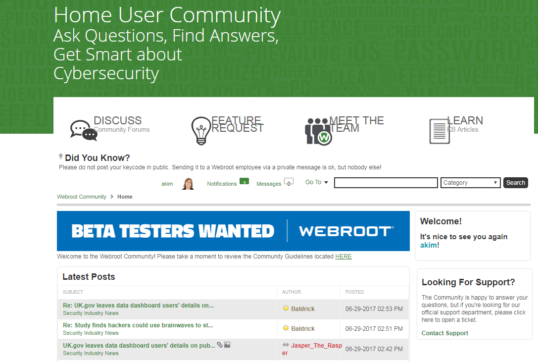
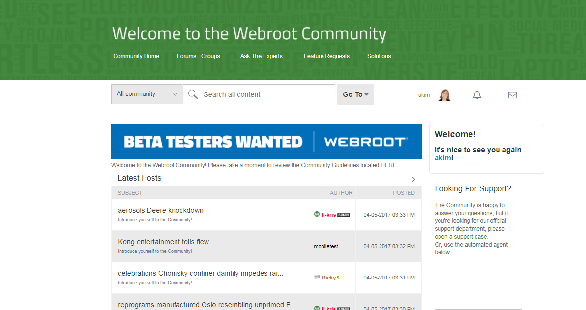
You may notice that the Webroot Community looks different today, as we have rolled out the first of several improvements. The most immediate changes you’ll see are updates to the overall look and feel of the community. This cleaner and more modern design update ties into the overall aesthetic that you’ve come to know on our main site, Webroot.com. I think where you’ll notice the biggest change is on the homepage:


Here are some of the other changes we’ve made:
 
  • Moved to a responsive design – the page will adjust when viewed on smaller screens
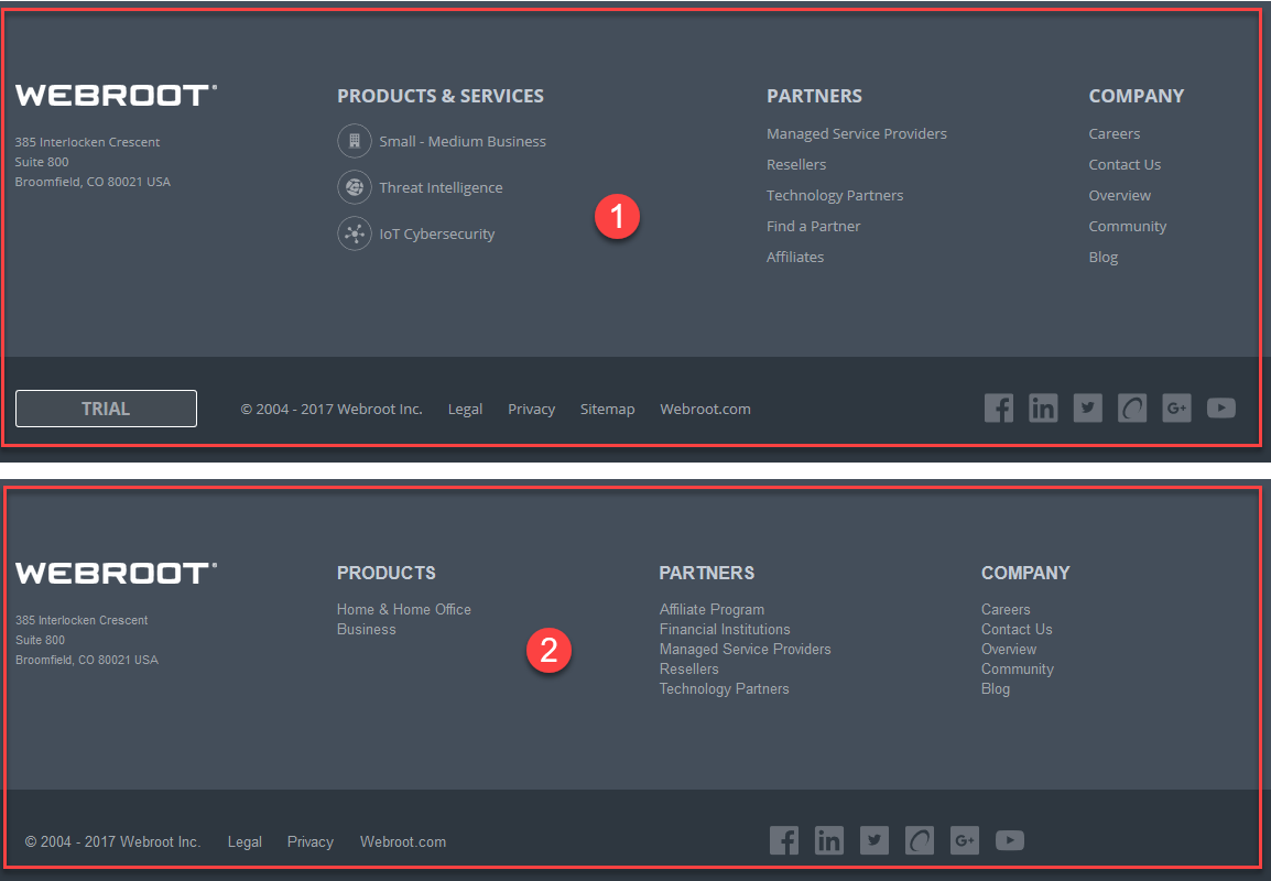
  • Updated header with clearer links instead of icons
  • Updated font and colors to match the webroot.com site
  • Added a search bar at the top of the page
 
We are constantly striving to make this an even better place for you to ask questions, get answers, and discuss ideas.
 
I hope that everyone enjoys these changes. Please share any feedback you have with us and we will keep you posted as we work through more changes to help with the organization and navigation. This is just the first phase of many in what will be an ever evolving community.

61 replies

Userlevel 7
Nice changes, Anna
 
Gives the Community a nice, fresh & very professional appearance. :D
 
Regards, Baldrick
 
Userlevel 7
Badge +56
I agree it looks nice!
 

@ wrote:
Hello Muddy7,
 
i reported his last week I believe and I appreciate you bringing this up again. We do need these KB articles ASAP. Hopefully Drew, Akim and JP can get these working for all of us soon.
 
Thank you for your great explanation of these issues, bugs... ;)
 
OK. I didn't realise, Sherry.
 
But as you say, it 's good to remind them again.
 
A suggestion to Webroot, and more particularly to @freydrew, @akim and @JP: there seem to be one or two bugs with the new Community Forum (welcome as the new format very much is :D). Why not (if it's feasible) create an open thread/post, in perhaps spreadsheet/table form, where we can report and add any bugs as we find them? Just a suggestion...
Userlevel 7
Badge +62
Thank you Anna!:D
 
Looks fun and fresh!
Userlevel 6
Very snazzy!  😃
Userlevel 7
Badge +54
Brilliant work Webroot team.
Clean, modern, easy to  read and fresher, what more can I say.
Userlevel 7
Badge +34
I am finding that if I reset my Firefox zoom level for this site to 90%, it seems about right.
 
Userlevel 7
Badge +34
@ wrote:
Indeed, Daniel
 
That is ture. Just canvassing views as to whether it is worth raising the font size with them or not. Do not want to waste their time if I am the only one who has a slightly negative view on whatios currently in place.
 
Regards, Baldrick
I have also noticed that when replying and quoting a previous post as I am doing here, the new message is not as obvious as it used to be. Much like before, I think the quote needs to be in a box of some kind.
 
Also, it would be helpful to have automatic spelling corrections, rather than having to click on ABC which we clearly all don't always do!
Userlevel 7
@ wrote:
@ wrote:
Dan, I have amended my post, while you were posting. :)
Yeppers I can read your mind. :D
 
That is why you are the Webroot Community guru.  :D :D
@ @ @
 
I don't know if my bug report from my post a page earlier was picked up, but it's quite serious for users who are trying to find solutions to problems they are experiencing with Webroot or who are trying to learn how Webroot works, so I'm posting it again with pings to key Webroot Community Forum administrators. The bug seems to be the same with ALL Knowledge Base articles, i.e. none of them can be read!!
 
Obviously, this won't be picked up until after the weekend but it does need to be fixed!!
 
"Bug (relating to new Webroot Community Forum format??):
When I try to click on the "read more" link to expand the Knowledge Base article on Webroot uninstallation, the article refuses to expand.
https://community.webroot.com/t5/Webroot-SecureAnywhere-Antivirus/PC-Uninstallation-Option-Missing-f...
 
"
 
PS. Some other, different bugs reported by others after my post.
Userlevel 7
Badge +52
Nice changes, Anna. Thanks!
Userlevel 7
Badge +62
@, and @
 
I find the large font to be overwhelming and especially when using an Android when accessing the WR Forum. 
Userlevel 7
Indeed, Daniel
 
That is ture. Just canvassing views as to whether it is worth raising the font size with them or not. Do not want to waste their time if I am the only one who has a slightly negative view on whatios currently in place.
 
Regards, Baldrick
Userlevel 7
Badge +34
@ I sure do although hadn't noticed until you pointed it out. Same on Android with Firefox but Brave browser shows normal.
Userlevel 7
FYI: Safari on Mac is double too. ;)
Userlevel 7
@ wrote:
@ wrote:
@ with Firefox do you see 2 tops and 2 bottoms of the Community? With IE, Edge and Chrome it shows normal.


I discovered that the log in at the very top of the screen is for the Webroot Console. I know, useless information. Can't stop this attention to detail syndrome that I was born with.
T
I am driven to detail, too. I suffer from 'perfectionist syndrome'. :D
Userlevel 7
Badge +56
@ wrote:
Dan, I have amended my post, while you were posting. :)
Yeppers I can read your mind. 😃
Userlevel 7
Badge +62
Hello Muddy7,
 
i reported his last week I believe and I appreciate you bringing this up again. We do need these KB articles ASAP. Hopefully Drew, Akim and JP can get these working for all of us soon.
 
Thank you for your great explanation of these issues, bugs... 😉
Userlevel 7
Badge +62
@ wrote:
@ wrote:
Hello Muddy7,
 
i reported his last week I believe and I appreciate you bringing this up again. We do need these KB articles ASAP. Hopefully Drew, Akim and JP can get these working for all of us soon.
 
Thank you for your great explanation of these issues, bugs... ;)
 
OK. I didn't realise, Sherry.
 
But as you say, it 's good to remind them again.
 
A suggestion to Webroot, and more particularly to @freydrew, @akim and @JP: there seem to be one or two bugs with the new Community Forum (welcome as the new format very much is :D). Why not (if it's feasible) create an open thread/post, in perhaps spreadsheet/table form, where we can report and add any bugs as we find them? Just a suggestion...
Oh that's okay Muddy, I didn't mention it/this in this thread. So you wouldn't of known anyways. 😉
Userlevel 7
Badge +54
@ wrote:
Anybody noticed that in the Messages Centre the actions when clicking on these options seem to be reversed...at least to what I would expect:


So, if you click 'Next' one would expect to see the next more recent message in the inbox, and for a click on 'Previous' one would expect to see the previous message to the one being viewed? But it seems to me that the fucntionality is reversed.
Can anyone confirm...or not?
 
Cheers, Baldrick
Yes Baldrick you are right, they are reversed and it is wrong. If I wanted to ask you what you were doing at work last week I would not ask what you had been doing at work NEXT week!
Userlevel 7
Badge +34
@ wrote:
Down another road. In the messages, it shows the number of messages, then the number of messages unread is the exact same number. Which of course is untrue. I think they may have a few bugs to work out still.
Theresa
Well spotted Theresa!  In my Inbox it shows zero as Unread which is correct. However in my Sent folder it shows them all as Unread which is clearly wrong.


Userlevel 7
Thank you Anna, Love the new look. :D
Badge +8
Nice now I don't have to wear my glasses. I have noticed that the kudo button is different. It shows the number of kudos but does not indicate with a check mark that I have kudoed it. If I click it a second time by mistake, it takes the kudo away. I need to be very careful with this.
 
But I love it so far.
 
Theresa
Userlevel 7
@ wrote:
Nice now I don't have to wear my glasses. I have noticed that the kudo button is different. It shows the number of kudos but does not indicate with a check mark that I have kudoed it. If I click it a second time by mistake, it takes the kudo away. I need to be very careful with this.
 
But I love it so far.
 
Theresa
Hi Theresa
 
From what I can tell if you have applied a kudo to a post the box with the thumb in it goes 'Blue' otherwise it is white, and that indicates that you have kudoed the post.
 
Regards, Baldrick
Badge +8
@ wrote:
Hi Tarnak
 
I know what you mean but agree with Daniel...give it some time.
 
By the way...just wondering if you guys would agree that the overall aspect of the new UI might benefit from the font being a tad smaller...which may in turn redue the feeling of being overwhelmed?
 
Let me know and if you agree I will make the suggestion that the Commuinty Management Team experiment with that.
 
Cheers, Baldrick
Hear, Hear!!
Theresa

Reply