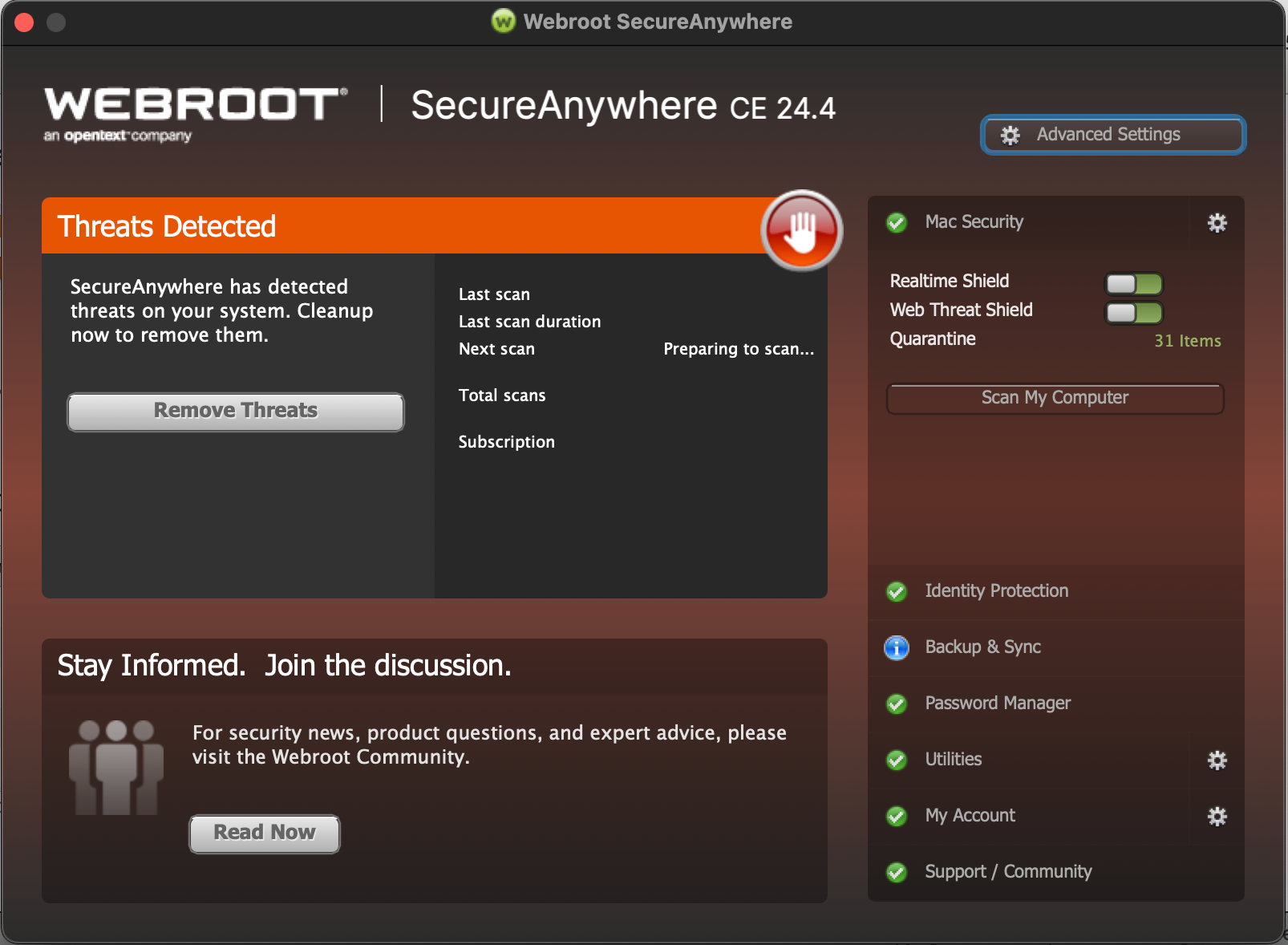
I think I have borough this up before, but again, I am at a loss to exactly what to push or tap to see WHAT the program has found. So as a UI designer, once again I will complain that this is an AWFUL interface. If I am warned about a potential threat, I should not have to guess or search for the first thing someone will want to do: See the threats.

I am going to assume “Remove Threats” will do just that, remove what IT thinks are threats. But frankly, Webroot has removed things it thought were threats hat actually broke the system and were not threats. So I need to see a list first.
OK, so I actually found a way to see the list. You click on the TINY GREEN words that says, “31 items”. That takes me to Quarantine and from there I can see a tab called threats. Very round about.
But several problems here: One, “31 items” is in green. Usually the color that nothing is wrong. Two, it is not obvious that one can click on the words “31 items”. They are not underlined like a link might be, and as I said, they are green (no Star Trek pun intended here.)
I tried clicking on the word Mac Security, and all it does is switch from white to gray. BUT the green check mark changed to an orange STOP hand. (that actually made me laugh, like it was telling me not to do that again.)
Then I tried the little gear to the right of the Mac Security words. OH, there they are. Come on, a gear next to Mac Security is not very obvious that it would show me a list of threats. It looks like a settings icon, not an action button to see threats.
Seriously Webroot, this interface needs a complete work over. I have been using Webroot for what a decade now, and I still have problems finding the right item to click? Not a good UI.
And while I am complain about UI, how do I tell the program to ignore something it thinks is always a threat. If it flags something, and that something is a thing I know is not a threat, how do I say “Ignore” on this item (something I had in previous programs)? This is something I can't find anywhere.


