by: Jamie Cuevas

The Home app on iPhone, iPad, and Mac is a useful hub for managing your Homekit accessories, smart speakers, Homepods, and other smart devices. One nice customization to add to the Home app is to rename your Home setup from “My Home” to something more specific, perhaps your street name or something more easily identifiable, and that customization becomes particularly useful if you share Home access with other people, other households, or other houses. 

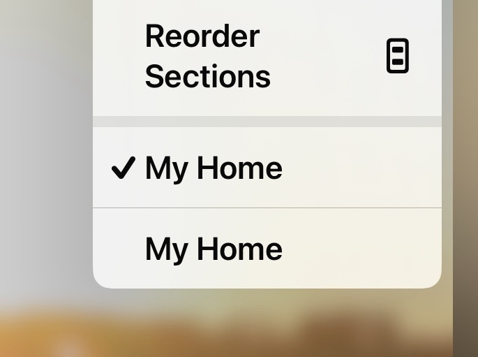
For example, maybe your partner, friend, or family, has given you access to their Home app and all the abilities to control accessories and automations, but if you all have your Home labeled as “My Home” that can be confusing when you go to select particular home setups.

Let’s rename “My Home” in Home app on iPhone, iPad, or Mac, it’s quite easy.


★★ Full Article ★★

It’s amazing how often the … option is missed be people. To be honest, it isn’t obvious unless you know about it!


Hmm, I did not find this confusing. Press the circle with three dots, and select Home Settings, and the name can be changed. So I agree with Russel here, how do people miss this? 


If you use an Apple device these days, especially iOS or iPadOS, surely you know about the 3 dots as they’re everywhere!


Agreed. I always hate when a software company feels they need to update the UI with a new release. The hamburger three lines gave way to the three dots. What’s next?  Adobe and Microsoft are the worst offenders IMO, moving tools and tool bars all over the place with each release, but Apple is doing it too, changing how a learned interface had “improved” with a new version. Often it’s more taps or clicks too. 
 

I assume this is to show people that something is new. I guess if they just changed the underlying code, people would feel like they got nothing new  


Good point. Sometimes a change isn’t always easier 


Reply