February 17, 2017 By Catalin Cimpanu
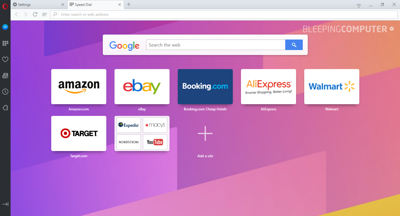
Starting with Opera 44, currently the Developer Edition, Opera will receive a brand new user interface, which includes a few minor changes compared to the existing UI, along with a new major feature, which is Facebook Messenger integration.
The new UI isn't all that different from the current Opera UI, but it's more refined and simplistic, and it certainly does its job, as no browser looks like Opera anymore.
The new UI also includes support for a light and dark theme, which can be activated from the sprocket icon in the top-right corner of the Speed Dial tab.
Full Article
Login to the community
No account yet? Create an account
Enter your E-mail address. We'll send you an e-mail with instructions to reset your password.


